Introduction
Line plots
Multiple histograms
Other plot types
Instruction
You did a great job! Let's introduce one more plot type: bar plots. Again, we're not going to delve into the details, because bar plots are constructed in the same way as other plot types. Take a look:
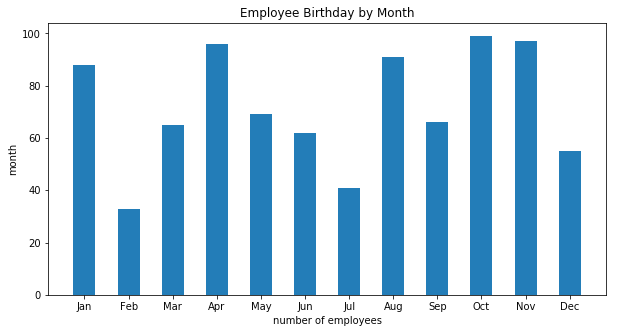
birthdays = pd.read_csv('employee_birth.csv')
figure = plt.figure(figsize=(10, 5))
bar_subplot = plt.subplot(111)
bar_subplot.set_title('Employee Birthday by Month')
bar_subplot.set_xlabel('number of employees')
bar_subplot.set_ylabel('month')
plt.xticks(range(len(birthdays['month'])), birthdays['month'])

plt.bar(birthdays['sequence'], birthdays['employees'], width=0.5)
We used plt.bar(...) to create a bar plot in our figure. We provided the following arguments:
birthdays['sequence']for the x-axis (required),birthdays['employees']for the y-axis (required),width=0.5, for the width of individual bars (optional).
As you can see, bar plots are not that difficult to create.
Exercise
Use the used_cars.csv dataset with average used car prices to create the following plot:
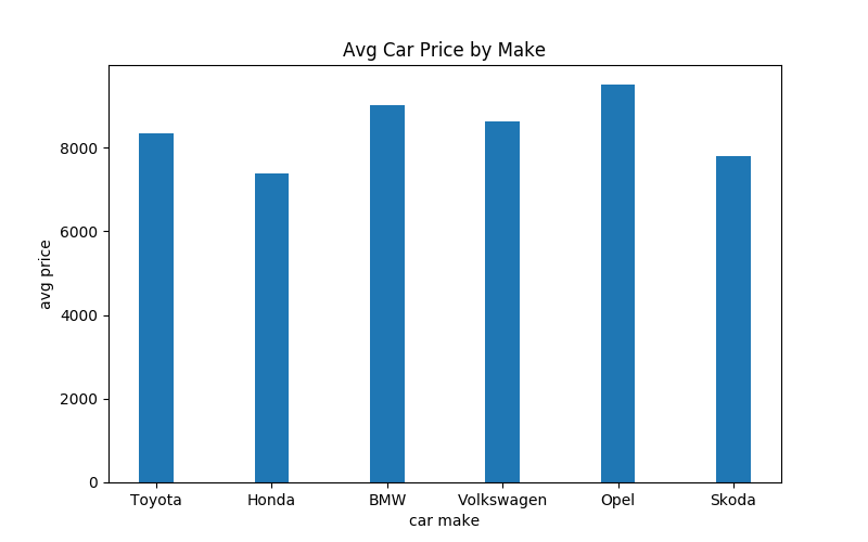
Hints:
- Use a figsize of 8x5.
- Set the bar width to 0.3
Stuck? Here's a hint!
Assuming your DataFrame is available in a variable named used_cars, you can plot the bars with:
plt.bar(used_cars['make'], used_cars['price'], width=0.3)