Introduction
Line plots
Multiple histograms
Other plot types
Instruction
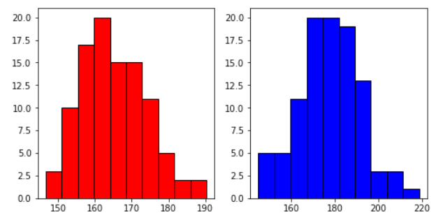
Great. Now, we want to plot the actual histograms: one in the left subplot, and another in the right subplot. Take a look:
subplot1.hist(diamonds['Women'], facecolor='red', edgecolor='black')
subplot2.hist(diamonds['Men'], facecolor='b', edgecolor='black')
To show a histogram, we use the hist() function on each subplot. The first argument of hist() describes the column whose distribution we want to show (in this case - the Women/Men column from the diamonds dataset. We want the left subplot to show women's data, and the right subplot to show men's data. We also provide optional arguments for both histograms: facecolor defines the colors of the bars, and edgecolor – determines the colors of the borders.
The result we get is as follows:
Exercise
Draw a histogram for each subplot. Use the salaries dataset.
- Histogram for accounting (the
accountingcolumn), Bar color: red, Border color: black. - Histogram for it (the
itcolumn), Bar color: orange, Border color: black. - Histogram for consulting (the
consultingcolumn), Bar color: purple, Border color: black.
Stuck? Here's a hint!
To create the first histogram, use:
subplot1.hist(salaries['accounting'], facecolor='red', edgecolor='black')