Instruction
Great! Now, we have another problem: on the x-axis, instead of month names from our DataFrame (Jan, Feb, Mar…), we can only see numbers from 0 to 12. To change that, we need to add the following line of code somewhere before plt.show():
plt.xticks(range(len(climate['Month'])), climate['Month'])
plt.xticks takes two arguments. The first argument is the list of positions at which ticks (month names) should be placed. We use range() – the same function we used when creating loops – to create a range of numbers from zero to the length of climate['Month'] column, which is 12.
The second argument is a list of labels that should be placed at the positions specified by the first argument. In this case, we want to use the values in the climate['Month'] column.
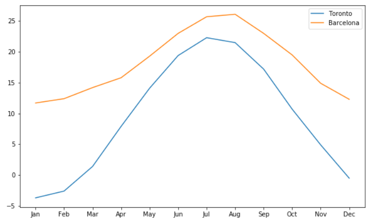
The result looks like this:
Exercise
Use the values of the year column from the books DataFrame as the labels for the x-axis ticks.
Stuck? Here's a hint!
Use the following code:
plt.xticks(range(len(books['year'])), books['year'])