Introduction
Line plots
Multiple histograms
Other plot types
Instruction
Excellent! At this point, we only need some final touches to the subplot:
subplot.grid(axis='y')
subplot.set_title('Mean temperatures in Toronto and Barcelona')
subplot.set_xlabel('month')
subplot.set_ylabel('mean temperature')
- Line 1 adds horizontal lines to the y-axis to increase readability.
- Line 2 sets the title that will be visible above the subplot.
- Line 3 sets the label of the x-axis.
- Line 4 sets the label of the y-axis.
- The result looks like this:
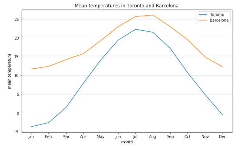
As you can see, creating a visually appealing line plot is quite easy! Mind that you can use the set_xlabel, set_ylabel, and set_title to all kinds of plots and subplots.
Exercise
Add the following elements to finish your line plot:
- Subplot title: Book Sales,
- X-axis label:
year, - Y-axis label:
profit, - Grid for both axes (tip: use
axis = 'both').
Stuck? Here's a hint!
To add a grid for both axes, use:
subplot.grid(axis='both')