In Chapter 1, we used histograms to analyze a single variable. Can we use them to visualize the relationship between two variables? Or do we need another type of chart to do that? Let's see.
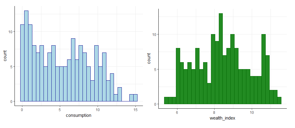
Below, there are two histograms, each representing one variable:
Can you answer the questions we asked earlier by using these charts? Look at the questions again and then try the exercise.
Is there a relationship between a country's wealth and its alcohol consumption?
What is the relationship? Do wealthier countries drink more or less alcohol than the others?
Are there any untypical countries or groups of countries? For example, are there wealthy countries with a high consumption of alcohol when most wealthy countries have a low consumption?
What values does each variable take? What are the minimal and maximal levels of alcohol consumption and wealth in the country?