In this case, our data is already prepared, so we can skip the "Prepare your data" step. We will use the data points as they are in the dataset.
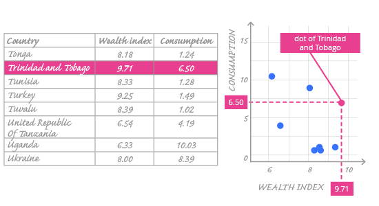
In the image above, we can see how particular values from our dataset are put on the chart. Looking at the highlighted row, we notice that one row of data is represented by one dot. The horizontal and vertical position of the dot is determined by two variables from the dataset: the horizontal position corresponds to the wealth_index value 9.71 and the vertical position corresponds to the consumption value 6.50. Both values can be approximately read from these axes.
Choose x and y (horizontal and vertical) axes that will best display your data.
Why are the wealth_index values on the horizontal axis, not the vertical one? Could it be the other way round?
It could, but that would make no sense. When using a scatter plot, we want to visualize how one variable relates to another, so we probably have in mind which one will influence the other. The variable that probably influences (or explains) the other is called the explanatory variable and it is always set on the x-axis. The "other" variable is called the response variable and is always set on the y-axis. We suspect that wealth may influence alcohol consumption, not that alcohol consumption influences wealth. So we put wealth on the x-axis and alcohol consumption on the y-axis.
The order of variables on a scatter plot is important – it can suggest the relationship.
