So histograms aren't useful for this type of problem. Let's meet a chart that can be used to visualize the relationship between two numerical variables: the scatter plot. Its scheme is presented below:
A scatter plot is a very simple chart. It consists of dots scattered across a grid formed by two numerical axes; each dot represents one observation from the dataset.
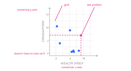
The main encoding in a scatter plot is the position (vertical and horizontal) of the dot, which is determined by data and the numerical axes chosen by the author. In a scatter plot, axes can comfortably start from non-zero values; this won't disturb the perception of variables' values in any way. Why? It is the dots' positions that encodes data. This depends solely on the distance between dots, not the distance from the middle of the coordinate system.
Use a proper grid to help the reader understand specific numerical values on the chart.
Although the axes and the dots carry most of the information in a scatter plot, the grid itself is also important. Until now, we’ve treated the grid as an unneeded element – it is often generated automatically for the categorical axis in ggplot2, and in bar charts or histograms it is redundant. A scatter plot, though, has two numerical axes and we need to be able to easily read values on both of them. Therefore, it’s important to always use a proper grid for both axes.
What is a proper grid for a scatter plot?
- A proper grid isn't too dense (there are many grid lines, all packed together) or too sparse ( there are few grid lines and it is hard to read values).
- A proper grid is subtle enough that is doesn't distract from the data, but it is visible enough to make it easy to understand the values.
