How not to show data on a π chart


In this article, we’ll take a look at some of god-awful pie charts and hopefully learn a thing or two about good data visualization.

March 14th is also known as PI Day. Mathematicians rejoice! π is a constant — the ratio of a circle’s circumference to its diameter — and it’s used in many different formulas. Baking and eating pies is super popular on this day — ’cause, you know, people just love their homophones. Today’s not Anna’s day, though. See, Anna hates math, and she’s terrible at making pies. And the one thing that’s worse than her cooked pies are her pie charts — yikes.
When it comes to making good pies and pie charts, Anna’s out of luck. She once brought a “salty-sweet” mince pie to work — a combination of fruit and meat. And boy was it bad.
Generally about a pie chart
You could imagine that Anna’s pie looked something like this:
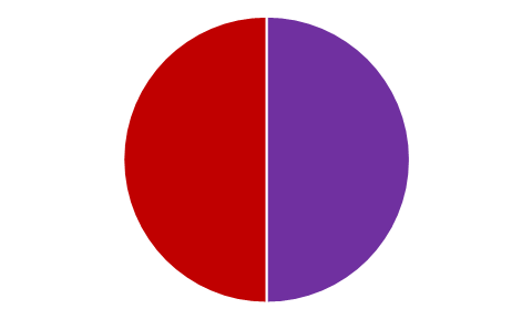
This visual is known as a pie chart. Charts of this type are used to show the proportions of different categories that are part of some whole. In the pie chart above, the whole is Anna’s pie, and the two colored regions represent the two main ingredients of her pie. Pie charts aren’t typically used to show 50–50 proportions, but this example will suffice for learning the basic elements of pie charts. Half of Anna’s pie contained meat (red), and the other half was fruit (purple). These parts are called slices.
Anna’s pie chart isn’t very informative. Surely we can do better, though. Can you tell what’s missing from her pie chart?
First off, when you just look at the chart, you have no idea what it’s about. So a title would certainly be helpful and appropriate.
Moreover, there are different colors on the chart, but you don’t know what each color represents — the chart’s legend is missing.
Last but not the least, the slice proportion labels are missing. So while it’s clear that they’re 50–50 in this case, it may not be so obvious if more ingredients (categories) are added to the chart.
Here’s the same chart with a title, labels, and legend:
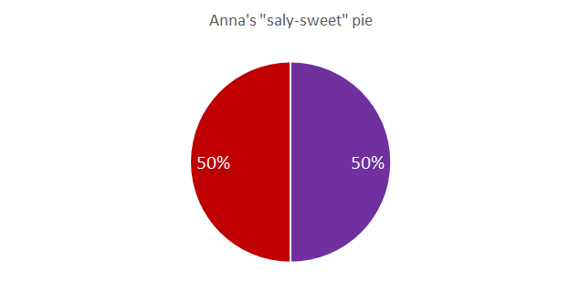
Looks better, right? Maybe we couldn’t save Anna’s cooked pie, but at least we improved her pie chart a bit.
Imagine if the pie slices were like the decimal portion of pi — going on indefinitely. We would’ve had to eat that pie forever. And no one deserves that kind of punishment.

PI as an irrational number
But enough about Anna’s pies—let’s get back to her pie charts. Anna is an analyst, and we all know that each data analysis needs some eye-catching visualizations. Let’s take a look at some more pie chart disasters.
Comparing two data sets with pie charts
Anna created two pie charts to show the differences in product sales between two offices of a company—one in L.A. and the other in New York. Her charts looked like this:
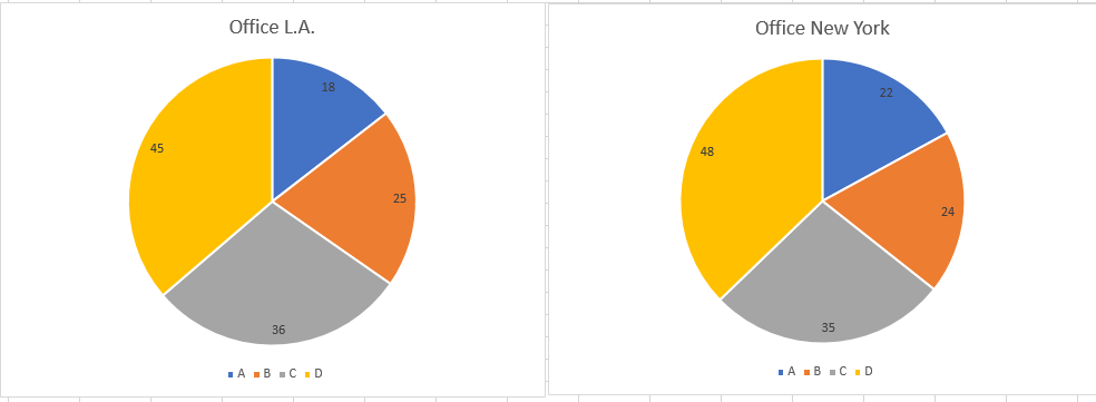
Pie charts used for office comparison
Now, pie charts aren’t really used for this kind of task. Why? Well, from the visuals above, you can’t easily tell whether product A was sold more frequently in L.A. or in New York. The slices look similar at first glance, so we cannot know for a fact.
Instead, to examine differences between two data sets, Anna should use a bar chart, like this:
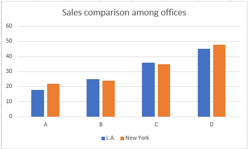
Bottom line: don’t use pie charts when you need to compare the slices of different pies.
Too many colors and poor legends
Anna’s next poorly constructed pie chart contains way too many meaningless colors and a legend that doesn’t really contribute to readability. Take a look:
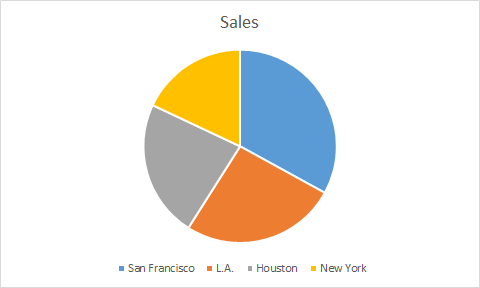
To understand what a particular slice represents, we have to track that color to the legend. And then we have to read the corresponding name of the city and put two and two together.
Granted, that’s not a very difficult task for the average person, but reading a chart should require minimal effort. In this case, it’s better to directly label each slice and get rid of the legend entirely, like this:
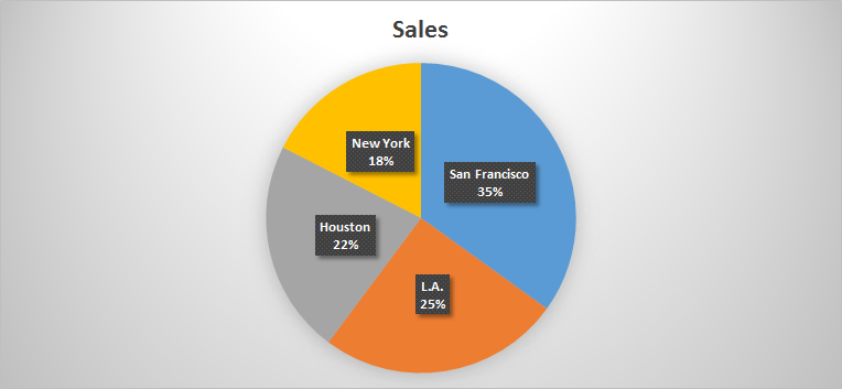
Directly labeling a pie chart
This introduces another problem: now that we’ve directly labeled our slices, we no longer need all these different colors. While the graph certainly looks lively and “pretty”, the colors don’t offer any useful information—and some people may even find them distracting. It’s also difficult to highlight a particular slice as the center of attention when there are so many colors on screen.
Instead, what we should do is pick a single color to use for all the slices and then darken the slice we wish to emphasize. Here’s an example:
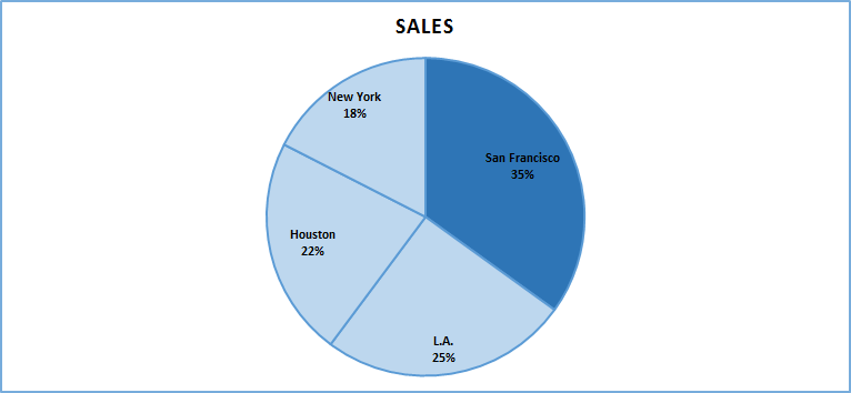
Are sales in Houston higher than sales in L.A.?
When you need to answer questions like this, it’s not a good idea to use pie charts. From the blue pie chart above, we could have certainly answered this question by reading the labels, but what are you going to do when the slices aren’t labeled or you have multiple slices to compare? Pie charts are good when you need to compare parts to a whole but are not so good when you need to compare parts to each other (especially when you have a lot of parts —then this can be difficult). Why? In the case of a pie chart, you’re comparing slice angles; observing/comparing angles with the human eye can be tricky. Bar charts are actually much better for comparing groups/slices.
Anna, here’s some advice: not all information should be presented with a pie chart! Choose your charts wisely. Finding answers to questions is quite easy with the right type of chart — a piece of cake, really 🙂
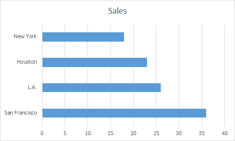
A horizontal bar chart
Don’t show too many slices
Too many slices on a pie chart can be overwhelming and confusing:
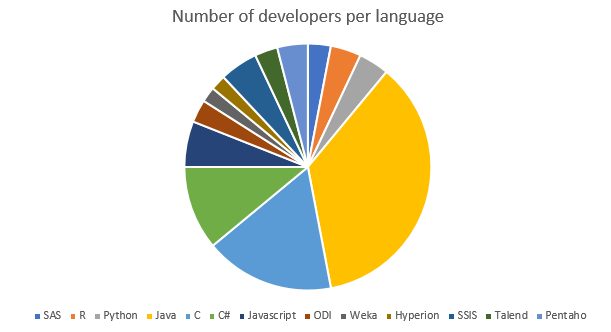
You want to be conservative with how much information you show on any type of graph. It’s best to limit the number of slices you use in a pie chart to 4–5 at most. Anything beyond that will reduce readability.
If you find that you need to present more slices, reorganize your data! You can always create a lump category like “Other” to group categories that aren’t too important.
If someone asked you which of these programming languages is the most popular, could you tell at a glance? This is difficult to answer because of all the colors and similarly sized slices. Instead, Anna should create a pie chart like the one below:
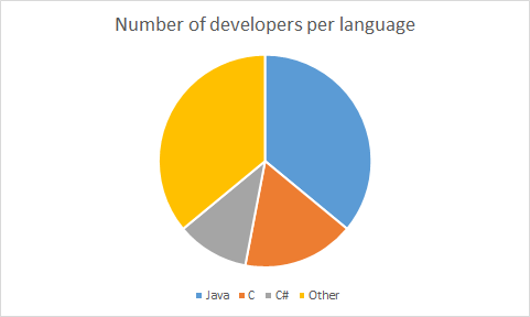
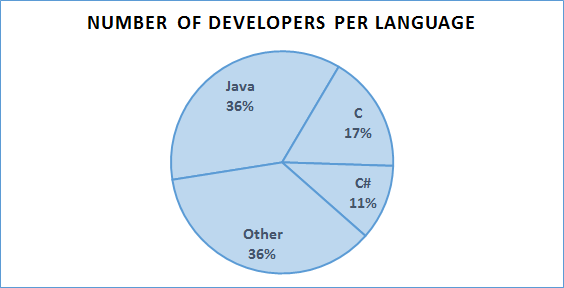
Here, we presented only the three most popular categories and grouped the remaining languages under Other. Better, right? We can make this pie chart even better by eliminating the colors and labeling the slices directly.
Hmm… 3D pie charts?
Anna soon discovered 3D charts, and they quickly became her new favorite thing. But she went a bit overboard. Soon, her charts started to look something like this:
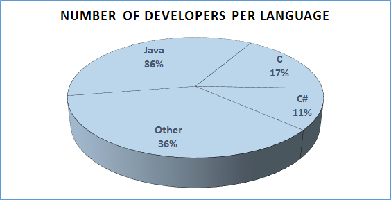
A typical 3D plot
Neato. But this third dimension can have a negative impact on data accuracy because it distorts the perceived sizes of the slices. Notice how the Other category, while equal in proportion to the Java category (36%), looks slightly bigger because it is “closer” to us. My advice? Never use 3D charts.
Conclusion
Baking a pie is an art, and the same goes for making pie charts 😉 Whenever you’re creating pie chart, keep in mind the following:
- Always use a title, appropriate labels, and a legend.
- Don’t use too many colors. Just one or two will do.
- Pie charts should contain at most 4–5 slices. Don’t use too many.
- Pie charts are great for comparing parts to a whole. If you need to compare two or more data sets, use bar charts.
- Don’t use 3D pie charts. They’re fancy—but also confusing.
Pie charts are simple and intuitive. But remember: they can be very easily turned into a nightmare if you use them like Anna did. Hopefully, she learned how to improve her data visualization skills. Not gonna lie, though, her pies are still pretty awful.