The last chart in this course will help us see relationships between two categorical variables. It's easier to read than the grouped bar chart, but this comes at a cost: the ability to easily compare numbers.
Meet the mosaic plot. The scheme of the mosaic plot is presented below:
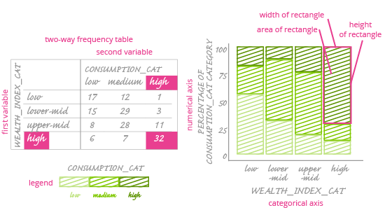
It is often said that a mosaic plot is the visualization of a two-way frequency table. What is a two-way frequency table? It's just like a regular frequency table, except it has two variables. We've put an image of one above, next to the mosaic plot.
In the two-way frequency table, rows correspond with one variable and columns with another. Frequencies are placed on the intersection of each row and column.
Now we know what a frequency table is. How can we visualize it on a chart?
A mosaic plot consists of two axes: a horizontal (categorical) one and a vertical (numerical) one. The numerical axis ranges from 0% to 100%. There's also one main box area on the plot, which is divided into smaller rectangles. The number of these rectangles is equal to the number of cells in the two-way frequency table. The area of each rectangle corresponds to the frequency of each cell in the frequency table.
Important: The area of each smaller rectangle is what encodes values. Unfortunately, it is a very weak way to compare values. Comparing one dimension at a time – e.g. the length of each rectangle – is simple, but if you also change the width of each rectangle, it is nearly impossible to tell which one is bigger, based on their areas.
Fortunately, we can look at a mosaic plot from different angles, e.g. focusing a) on the height of rectangles and b) on their width. Rectangle width is related to percentages, not raw frequencies. We will learn more about this as we see how a mosaic plot is constructed.
