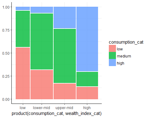
We finally created a mosaic plot for our data. Remember that our main goal was visualizing the distribution of the categorical variables wealth_index_cat and consumption_cat. Below, you can see the plot from the previous exercise. It will help you answer the questions we asked in the beginning of this chapter:
- Is there a relationship between a country's wealth and its alcohol consumption?
- What is the relationship? Do wealthier countries drink more or less alcohol than the others?
- Are there any untypical countries or groups of countries? For example, are there wealthy countries with a high consumption of alcohol when most wealthy countries have a low consumption?
- What values does each variable take? What are the minimal and maximal levels of alcohol consumption and wealth in the country?
- Which is the most frequent value?