Now we've arrived at the second and last stage of mosaic plot construction. This stage consists of dividing each bar according to the second variable. The scheme of this stage is presented below:
The second variable, consumption_cat, dictates how each bar should be divided. Let's add it to our plot.
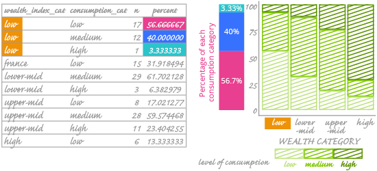
Look at the highlighted rows in the frequency table. They represent the "low" level of the wealth index. We see that the wealth_index_cat value is constant; the consumption_cat value is what differs between rows. You can also see what percentage each consumption category makes up among countries with a "low" values in wealth_index_cat. The sum of these three percentages is 100%.
We see that low-consumption countries constitute 56.67% among countries with a "low" value in wealth_index_cat. On the chart, this number is encoded as the height of the lightest (and bottom-most) rectangle in the first bar. The legend indicates that this is consumption_cat percentage data.
Once we perform the same steps on the other alcohol consumption categories, we have the final version of our chart. Remember, the goal is to visualize relationships among categorical variables. But how can we understand that relationship here – or even know if there is one? We can't add a trend line or calculate the correlation coefficient; those are only for numerical variables.
What we can do is look at how the rectangles are arranged and assess the trend (or lack of trend) in the data. You can also use a chi-square test to determine if the rectangles are arranged randomly. We won't go into the details of the chi-square test; you can find them in any statistics handbook. For our data, the chi-square test suggests that there is a relationship between the variables.
