So we have our percentages, but what exactly do they encode? Consider it this way: We have one "main rectangle" that represents the total number of observations. Each axis of this rectangle corresponds to 100%. You can see it in the scheme below.
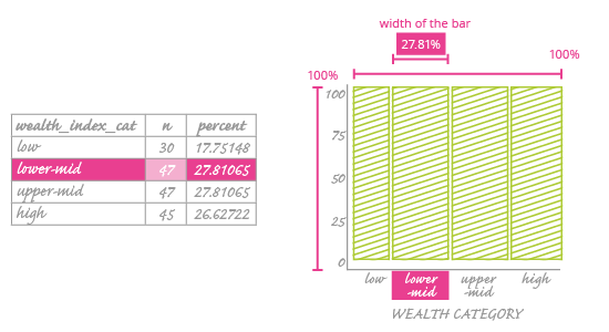
Now think of the explanatory variable (here it is the wealth category). You divide this main rectangle into bars, one for each of the wealth category values (low, lower-mid, upper-mid, high). The width of these bars won't be constant; it will vary to reflect how often that category occurs in the dataset.
As an example, look at the highlighted row in the table next to our mosaic plot. This shows that the lower-mid category occurs 27.8% of the time. So we set it as the second bar in our plot, with a width that corresponds to 27.8% of the main rectangle.
Set your variables on the x and y axes in a way that best serves your data.
As you can see, right now there is only one variable – wealth category. Is it important which variable we use as the explanatory variable?
It is very important, even more so than in a scatter plot.
In a scatter plot, putting a variable on the wrong axis can give an erroneous impression of the relationship between the data points – readers will confuse the explanatory variable with response variable. However, the data placed on the scatter plot won't change; it will just be turned around.
In a mosaic plot, the choice of explanatory variable (which goes on the x-axis) will dictate the entire construction of the plot – its appearance and the data it encodes. You could create two entirely separate plots using the same data! We will explain more about this as we continue this chapter.
