Developing Data Science Projects in Python: A Beginner’s Guide


When you already have some experience with Python, building your own portfolio of data science projects is the best way to showcase your skills to potential employers. But where do you begin with developing your very first Python project?
First, Why Develop a Data Science Project?
There are a number of career development benefits to creating your own data science project in a language such as Python:
- Studying. The best way to learn is by doing. Of course, you may need to take some introductory courses first to understand the basics of Python if you’re a complete beginner. Afterwards, you can learn on your own by defining an interesting problem and working on a solution using online tutorials, documentation, and forums.
- Practicing. Projects are a great opportunity to practice the skills you’ve acquired. By developing your own projects, you can apply your newly acquired knowledge to some real-world tasks. It’s also a great opportunity to test yourself—are you ready to create your own project from scratch?
- Demonstrating your skills. Even for an entry-level position, data science companies often prefer candidates with at least some exposure to a language like Python. A project is the best way to showcase your data science skills.
- Showing your motivation and dedication. When you finish your own project without any external incentives, it shows your potential employers that you’re truly passionate about pursuing a career in data science. From an employer’s perspective, self-motivated employees are a great investment.
And of course, if you pick a good project, you’ll also have fun. Anyone who loves to code will tell you there’s no feeling like solving real-life problems while getting your hands dirty.
5 Steps to Creating Your Own Data Science Project
Ready to get started? We’ll cover the following steps in this small sample project:
- Defining the project
- Preparing the data
- Exploring and visualizing the data
- Creating a machine learning model
- Presenting your findings
1. Defining the Project
Every data science project begins with a well-defined goal: What do you want to achieve with this project? You can apply similar logic when developing your first Python project for your portfolio: What skills do you want to demonstrate with this project?
The data science skills that employers are looking for include, but are not limited to:
- Data cleaning and wrangling
- Exploratory data analysis
- Machine learning
- Interpretation of findings
For example, to demonstrate your data cleanings skills, you may take some real-world messy data and prepare it for analysis. If you want to practice exploratory data analysis and machine learning, it’s possible to find some online datasets that are already preprocessed and ready for analysis.
We’ll take the second approach here, which allows us to demonstrate the principles of developing data science projects more efficiently. So, we’re going to use the famous Boston Housing dataset, which is available online but can be also loaded from the scikit-learn library. One bonus of using a popular dataset is that at the end of the project, you’ll be able to see how your model performs compared to those of others—just check Kaggle’s leaderboard.
The objective of this exploratory project is to predict housing prices using the 13 features (e.g., crime rate, area population, number of rooms per dwelling) and 506 samples available in the dataset.
2. Preparing the Data
We’ll start by importing the following data analysis and visualization libraries:
- NumPy
- pandas
- Matplotlib
- seaborn
If you’re unfamiliar with any of these, we cover most of them in our Intro to Python course.
# Importing libraries
import numpy as np
import pandas as pd

import matplotlib.pyplot as plt
import seaborn as sns
%matplotlib inline
The next step is to load the Boston Housing dataset from the scikit-learn library and explore its contents:
# Loading dataset
from sklearn.datasets import load_boston
boston_housing = load_boston()
print(boston_housing.keys())
dict_keys(['data', 'target', 'feature_names', 'DESCR'])
As you can see from the list of keys, the dataset contains data (values of 13 features), target (house prices), feature names, and DESCR (description).
In the description, you’ll find a thorough explanation of all the features of this dataset:
print (boston_housing.DESCR)
Boston House Prices dataset
===========================

Notes
------
Data Set Characteristics:

	:Number of Instances: 506

	:Number of Attributes: 13 numeric/categorical predictive

	:Median Value (attribute 14) is usually the target

	:Attribute Information (in order):
		- CRIM per capita crime rate by town
		- ZN proportion of residential land zoned for lots over 25,000 sq.ft.
		- INDUSproportion of non-retail business acres per town
		- CHAS Charles River dummy variable (= 1 if tract bounds river; 0 otherwise)
		- NOXnitric oxides concentration (parts per 10 million)
		- RM average number of rooms per dwelling
		- AGEproportion of owner-occupied units built prior to 1940
		- DISweighted distances to five Boston employment centres
		- RADindex of accessibility to radial highways
		- TAXfull-value property-tax rate per $10,000
		- PTRATIOpupil-teacher ratio by town
		- B1000(Bk - 0.63)^2 where Bk is the proportion of blacks by town
		- LSTAT% lower status of the population
		- MEDV Median value of owner-occupied homes in $1000's

	:Missing Attribute Values: None
Now it’s time to create a DataFrame with all the features and a target variable:
# Creating dataframe with features
boston_df = pd.DataFrame(boston_housing.data, columns = boston_housing.feature_names)
# Adding target variable to the dataset
boston_df['MEDV'] = boston_housing.target

boston_df.head()
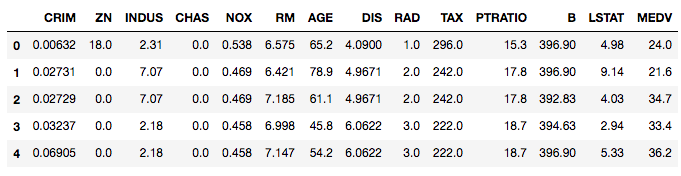
In the first step, we created a DataFrame with features only, and then we added a target variable—housing prices (MEDV).
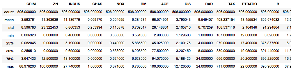
One last thing: It’s always a good idea to check your new dataset with the info() and describe() functions.
boston_df.info()
RangeIndex: 506 entries, 0 to 505
Data columns (total 14 columns):
CRIM 506 non-null float64
ZN 506 non-null float64
INDUS506 non-null float64
CHAS 506 non-null float64
NOX506 non-null float64
RM 506 non-null float64
AGE506 non-null float64
DIS506 non-null float64
RAD506 non-null float64
TAX506 non-null float64
PTRATIO506 non-null float64
B506 non-null float64
LSTAT506 non-null float64
MEDV 506 non-null float64
dtypes: float64(14)
memory usage: 55.4 KB
boston_df.describe()
Great! You’ve demonstrated how to create a DataFrame and prepare raw data for analysis. Let’s now continue with some exploratory data analysis.
3. Exploring and Visualizing the Data
Since this is a data science project intended to showcase your skills to potential employers, you may want to draw multiple plots of different types to display your data in an intuitive and understandable format.
Price distribution. We can start by looking at the distribution of our target variable (house prices):
sns.set_style(\"darkgrid\")
plt.figure (figsize=(10,6))

# Distribution of the target variable
sns.distplot(boston_df['MEDV'], axlabel = 'Median value of owner-occupied homes in $1000')
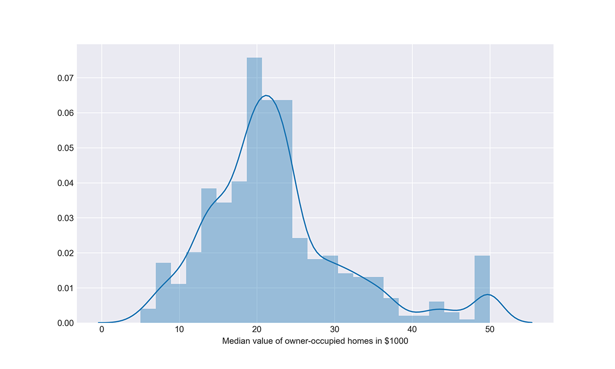
This plot shows that houses in the Boston area in the 1970s were valued at $20–25K on average, ranging from a minimum of $5K to a maximum of $50K.
Correlation matrix. Now let’s see how this target variable correlates with our features, as well as how our features are correlated to one another. For this task, we’ll first create a new DataFrame with correlations and then visualize it using a heat map:
# Correlation matrix
boston_corr = boston_df.corr()

plt.figure (figsize=(10,6))
sns.heatmap(boston_corr, annot = True, cmap = 'coolwarm')
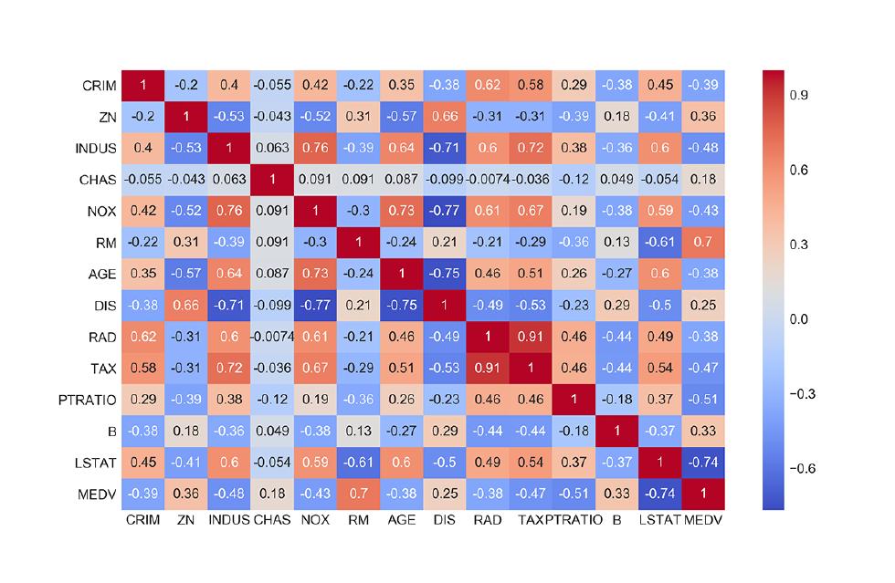
This correlation matrix shows that the median value of houses (MEDV) has a:
- Strong negative correlation (-0.74) with the share of the lower status population (
LSTAT). - Strong positive correlation (0.7) with the average number of rooms per dwelling (
RM).
Joint plots. We can now dive deeper into the relationships between these variables by using joint plots from the seaborn library. These plots show the distribution of each variable as well as the relationship between the variables. For example, let’s check if house prices are likely to be linearly dependent on the share of the lower status population in the area:
# Jointplots for high correlations - lower status population
plt.figure (figsize=(10,10))
sns.jointplot(x = 'LSTAT', y = 'MEDV', data = boston_df, kind = 'reg', size = 10, color = 'orange')
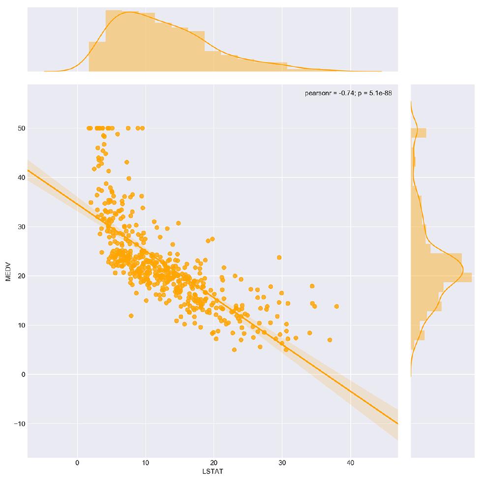
By using the optional reg parameter, we can see how well a linear regression model fits our data. In this case, our assumption about a linear relationship between the variables (LSTAT and MEDV) is quite plausible, as the data points appear to lie on a straight line.
We can also use other types of joint plots to visualize relationships between two variables. Let’s study how house prices related to the number of rooms using a hex joint plot:
# Jointplots for high correlations - number of rooms
plt.figure (figsize=(10,10))
sns.jointplot(x = 'RM', y = 'MEDV', data = boston_df, kind = 'hex', color = 'green', size = 10)
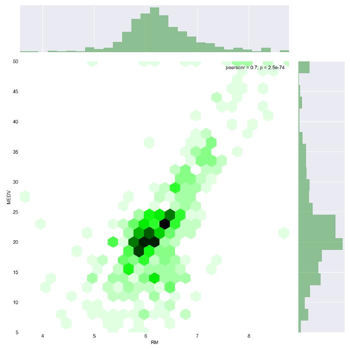
As you can see from the plot above, the sample cases include lots of houses with 6 rooms and a price around $20K. Furthermore, it’s clear from this visualization that a higher number of rooms is associated with a higher price. This relationship can be approximated with a linear regression model.
You can think about other ways to explore this dataset further. But in the meantime, let’s move on to the machine learning part of our project. Specifically, let’s see how we can model the relationship between our features and target variable so that the model’s predictions about housing prices are as accurate as possible.
4. Creating a Machine Learning Model
First, we need to prepare our dataset for this part of the project. In particular, we need to separate our features from the target variable and then divide the dataset into a training set (75%) and a test set (25%). We’re going to train our models on the training set and then evaluate their performance on the unseen data—the test set.
# Preparing the dataset
X = boston_df.drop(['MEDV'], axis = 1)
Y = boston_df['MEDV']
# Splitting into training and test sets
from sklearn.model_selection import train_test_split

X_train, X_test, Y_train, Y_test = train_test_split(X, Y, test_size = 0.25, random_state=100)
Linear regression. Now, we’re ready to train our first model. We’ll start with the simplest model—linear regression:
# Training the Linear Regression model
from sklearn.linear_model import LinearRegression

lm = LinearRegression()
lm.fit(X_train, Y_train)
LinearRegression(copy_X=True, fit_intercept=True, n_jobs=1, normalize=False)
In the above code, we’ve imported the LinearRegression model from the scikit-learn library and trained it on our dataset. Let’s now evaluate the model using two common metrics:
- Root-mean-square error (
RMSE) - R squared (
r2_score)
# Evaluating the Linear Regression model for the test set
from sklearn.metrics import mean_squared_error, r2_score
predictions = lm.predict(X_test)
RMSE_lm = np.sqrt(mean_squared_error(Y_test, predictions))
r2_lm = r2_score(Y_test, predictions)

print('RMSE_lm = {}'.format(RMSE_lm))
print('R2_lm = {}'.format(r2_lm))
RMSE_lm = 5.213352900070844
R2_lm = 0.7245555948195791
This model gives us an RMSE of about 5.2. Moreover, an R squared value of 0.72 means that this linear model explains 72% of the total response variable variation. This is not bad for the first try. Let’s see if we can achieve better performance with another model.
Random forest. This is a bit of a more advanced algorithm, but its implementation in Python is still fairly straightforward. You may want to experiment with the number of estimators and also set some random state to get consistent results:
# Training the Random Forest model
from sklearn.ensemble import RandomForestRegressor

rf = RandomForestRegressor(n_estimators = 10, random_state = 100)
rf.fit(X_train, Y_train)
RandomForestRegressor(bootstrap=True, criterion='mse', max_depth=None,
max_features='auto', max_leaf_nodes=None,
min_impurity_decrease=0.0, min_impurity_split=None,
min_samples_leaf=1, min_samples_split=2,
min_weight_fraction_leaf=0.0, n_estimators=10, n_jobs=1,
oob_score=False, random_state=100, verbose=0, warm_start=False)
# Evaluating the Random Forest model for the test set
predictions_rf = rf.predict(X_test)
RMSE_rf = np.sqrt(mean_squared_error(Y_test, predictions_rf))
r2_rf = r2_score(Y_test, predictions_rf)

print('RMSE_rf = {}'.format(RMSE_rf))
print('R2_rf = {}'.format(r2_rf))
RMSE_rf = 3.4989580001214895
R2_rf = 0.8759270334224734
It seems a random forest is a much better model of our Boston Housing dataset: The error is lower (RMSE = 3.5), and the share of explained variation is significantly higher (R squared of 0.88).
5. Presenting Your Findings
That’s it! Now it’s time to share your project with the world.
If you were using Jupyter Notebook as your Python IDE, you can share the notebook directly, but preferably save it as a PDF file so it’s more accessible. Another option is to share your Python projects via GitHub.
Don’t forget to include extensive comments on your findings. Drawing appealing and meaningful plots or building machine learning models are important skills, but a data scientist should be able to tell a story based on all the plots and models used. So, use each of your projects as an opportunity to demonstrate your skills of discovering patterns and drawing conclusions based on raw data.
In case you feel like you need additional guidance before developing your first project with Python, check our Introduction to Python for Data Science course. It covers lots of concepts required for developing successful projects not only during your study process but also when solving some real-life problems at your workplace.


