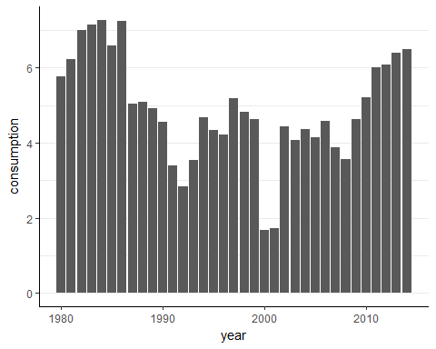
We've created a time series bar chart for our data. Our main goal is to visualize how alcohol consumption in Zimbabwe has changed over time. Below, you can see your plot from the previous exercise. It will help you answer the questions we asked earlier:
- Has alcohol consumption in Zimbabwe steadily increased?
- What are the highest and lowest levels of alcohol consumption in Zimbabwe? When did they occur?
- What is the typical range of alcohol consumption in Zimbabwe?
- How much larger is the maximum consumption level than the minimum level?
- Are there any obvious patterns of alcohol consumption?
- How did Zimbabwe's alcohol consumption level change in the last three decades? How did it change in the last decade?