Congratulations! In this chapter, we talked about visualizing change over time.
You’ve completed all the exercises in this part, but let’s have a summary before we move on.
Time has a dual nature: it can represent one exact moment (like one minute) or a longer period (like a decade). In data visualization, we can interpret time variables in one of two ways:
- If the variable represents a period of time (e.g. a decade), we treat it as a categorical ordinal variable.
- If the variable represents a point in time (e.g. a minute), we treat it as a numerical variable.
To visualize change over time, we need time-series data. A time series is a dataset that contains two columns:
- A numerical variable, where each value represents something at a specific moment in time, and
- A time variable, which tells us when the numerical value was recorded.
We can use bar charts to visualize change over time.
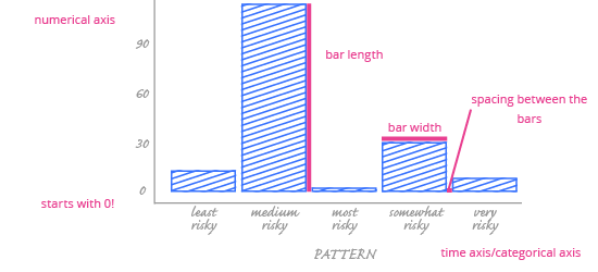
When you’re using a time variable categorically – that is, when the variable represents periods of time – bar charts are the natural choice to visualize time-series data. Why?
- Readers can quickly grasp the magnitude of numerical values for each period.
- It’s also easy to understand the difference between values.
Follow these best practices when using a bar chart to show change over time:
- Always start the y-axis at 0, even for time-series data.
- Adding color to your bars will make the data stand out. Remember, though, that your goal is to highlight the story, not decorate the chart!
- Don’t use a bar chart to show trends over time – reading trends from a bar chart is hard.
Next up, we’ll discuss another chart type used to visualize change over time: the line chart.