Another way we can visualize a part of a whole problem is to use a 100% stacked bar chart.
We mostly use this type of chart to visualize percentages for more than one group. In our case, this means percentages for more than one country. It's also a good time to see a different approach to presenting parts of a whole. When you meet this chart in its more complex, multi-group version, you will have no problem reading it.
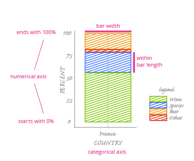
A 100% stacked bar chart consists of one or more bars which have been divided into smaller segments. (In this course, we'll only use one bar per chart.) Each segment stands for one category of a categorical variable (here, one beverage type). Each bar represents one group (here, France). The height of the entire bar represents 100%, so the corresponding vertical numeric axis ranges from 0% to 100%. The horizontal axis is categorical - it describes groups.
The height of each segment corresponds with a percentage; its width has no meaning. You can set it how you like, but it is best to make it less than the bar height.
Each segment is colored so that readers can easily distinguish the associated category. As with a pie chart, color and category information are displayed in a chart legend.
