Pie charts that visualize many values suffer from a lot of problems. They are cluttered and complicated. They're hard to read. And, once the values get smaller and smaller, they can be hard to compare in size.
In reality, this tip should be extended to every chart that visualizes parts of a whole by dividing a common area into sections. If you have a few larger values and a bunch of smaller values, you should either use a different chart or group the small values into one category (such as "Other").
An illustration of this problem is presented in the chart below. Suppose a company sells 12 different products and wants to visualize how much profit each product contributes. If we use a pie chart for this, we get:
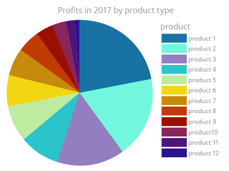
What can you tell by looking at this chart? Do you know how big the percentages for products 11 and 12 are? Is it 1%? 3%? Are they equal? All you can see is lots of small slices that can't be effectively compared. They make this chart more cluttered. What can you do in this situation? The exercise on the right will propose some solutions, but for now remember: don't use a pie chart to compare more than 6 categories.
