We have already prepared our data by converting it to percentages. You can see it on the scheme below. Let's see how to put this on a 100% stacked bar chart.
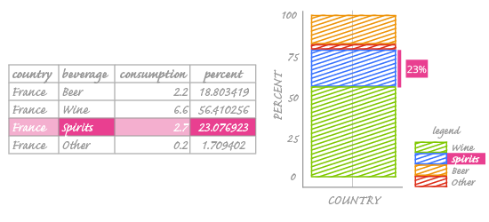
In the image above, we can see how the values from our table are put on the chart. Looking at the highlighted row, we notice that the name of the beverage (Spirits) is set in the legend and its percentage of the whole (23%) is visualized by the height of that particular segment.
Important! Segment height, not width, encodes values on a 100% stacked bar chart! We can read values by measuring the segment height and looking at the vertical axis. It's easy to do this for the first and last segments; the first starts at 0% and the last ends on 100%. Unfortunately, reading quantities from the middle segments is more difficult. You have to look at both the top and bottom of the segment, read their position on the vertical axis, and calculate the difference. In the exercise on the right, you will find some solutions for this problem.
