In the next two exercises, we will highlight two situations where pie chart usage should be avoided.
Sometimes all parts of the whole are similar. For example, suppose you want to visualize how your typical day looks. Maybe you sleep for 7.5 hours, work for 8 hours, and relax for 8.5 hours. This works out to sleeping for 31% of your day, working for 33% and resting for 36%.
This is what the pie chart will represent:
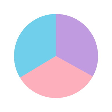
Can you guess which slice corresponds to which activity? And even if you can, can you determine the differences between activities just by looking at the chart? Probably not. These questions are natural when you see a chart like this.
As we know, pie charts encode values by angles. When the visualized values (percentages) are similar, the angles on the chart are also proportionally similar; it is almost impossible to decide which value is largest.
Remember, your chart should help you present the story. In this situation, it is better to use a bar chart.
