Look at you – all finished with the pie chart exercises!
Let’s recap what you need to know about the pie chart. This chart can be used to show the composition (parts of a whole) of a dataset.
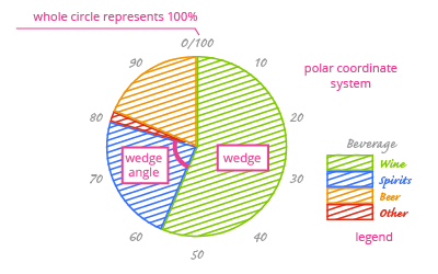
To make a pie chart, we need two kinds of data:
- Non-overlapping categories, and
- The percentages calculated for each category. These values add up to 100%, or the total magnitude of the situation.
Pie chart data can arrive in raw or aggregated form. You have to aggregate the raw data on your own, but you can use aggregated data as-is.
When building a pie chart, remember to:
- Choose a qualitative color scale for your pie chart’s wedges. In a qualitative scale, each color is different but none stand out; there is no natural order for colors (as there might be if you used hues of the same color). This color scale helps the reader easily distinguish the different categories.
- If your categorical variable is nominal, sort the wedges according to their size.
- Pay attention to the "Other" category. Regardless of its share of the whole, this category is usually placed at the end of the chart. Why? Because in terms of its data, it is often the least interesting category.
- Always include a legend that describes the categories in your chart.
- If exact values are important to your story, add value labels to the chart. Limit yourself to two decimal places for value labels, otherwise things will start to look cluttered.
Next up, we’ll look at another chart that can be used to visualize composition.