The pie chart is beloved by the media and hated by statisticians. Here is what some experts say about it:
I have a well‐documented disdain for pie charts. In short, they are evil.
Cole Nussbaumer Knaflic, author and data visualization expert
The only worse design than a pie chart is several of them.
Edward Tufte, professor and design theorist
So although it is very familiar, the pie chart has a bit of controversy surrounding it. But don't worry; we'll teach you the proper way to design and use it.
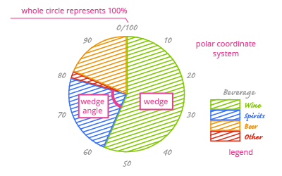
A pie chart consists of a circle (which represents the whole, or 100%) that is divided into wedges. The number of wedges is determined by the number of categories in the data we are presenting. The wedge angles, and therefore their sizes, represents the part of the whole made up by that category.
Pie charts lack a categorical axis, so we have to include category data in a legend. The legend should contain all of the following information:
- A legend title. This functions like a categorical axis title and describes the categories. In this example, it could be "Beverage".
- Category value names. Each wedge represents one category. The legend connects the wedge with the category it represents, e.g. "wine".
- Category colors. Each wedge representing a category will have a different color. The legend links color with category. For example, red might represent the "wine" in our chart.
Remember, your chart has to be understandable to a wide audience. You must ensure that everyone knows what variables are encoded in your chart. You can do this in many different ways, such as by adding a legend to the chart.
