At this point in the process, you should know your data and your story. Now you can begin to build the chart itself, starting with its form, or type.
There are many types of charts that we can use in data visualization. Some are specific to only one goal, such as depicting a trend in data, so their usage is limited to those stories. Others, like the bar chart, are more universal. In this course, we will explore the seven most popular charts.
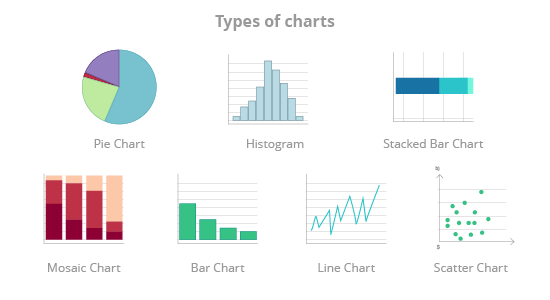
These charts use the following shapes to represent data:
- Bars:
- Bar chart;
- Histogram chart;
- Stacked bar chart;
- Lines: Line chart;
- Dots: Scatter chart;
- Parts of a circle: Pie chart;
- Rectangles: Mosaic chart;
Each of chart type will be presented in the chapter section called Visualize your data. We will learn how each chart is constructed, how to prepare data for it, and how data is encoded on it (i.e. what the size, shape, and/or position(s) of the data points mean). We'll also discuss the chart's pros and cons and what kind of data it works with.
