Welcome to Data Visualization 101! There's an old saying:
A picture is worth a thousand words.
A complex idea that needs many words of explanation can often be shown in
one simple image. But choosing the right image is not so simple. That's why the science (and art) of data visualization has been developed.
Imagine you work for a company that sells three different products. We'll call them Products A, B, and C. The monthly revenue for all products in 2016 is shown in the graph below. What do you make of this chart? Can you see any trends in each product's monthly sales?
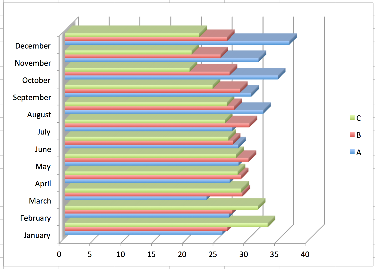
It's difficult to see any trends in this chart. Look at another chart representing the same data. Can you spot the trends now?
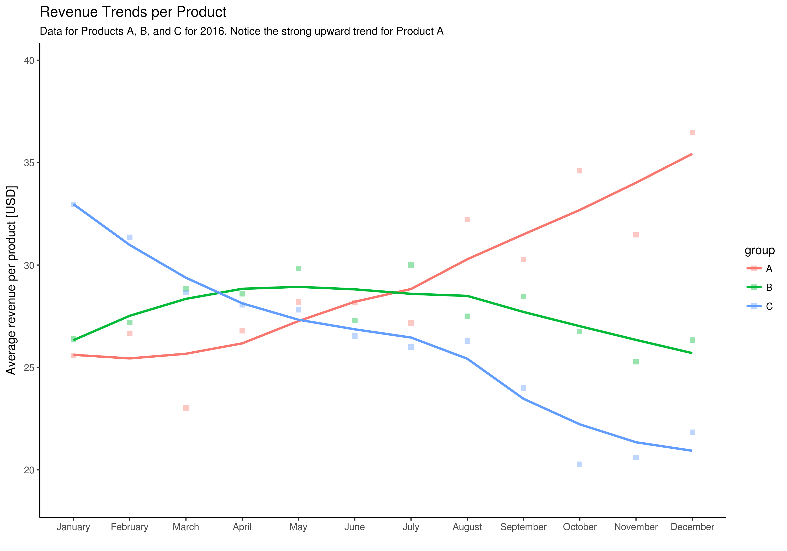
In this chart, it's easy to see the trends for each product. It is a scatter plot with added trend lines. These lines show how things change over time. Also, notice that there is a title, a legend, and an axis title along the side. Each of these tells the reader more about the data.
This chart works because its author considered the story they wanted to tell with this data. That's the goal of data visualization – it uses visual elements to tell a story in the simplest and clearest way.
In this course, we will teach you about basic chart types. But (and this is important) we will also teach you how to choose the right chart type for the data story you're trying to tell.
