If your bar chart is for your own use, you can stop here. But if you're presenting it to clients or to other departments, you'll probably want to clean it up a bit and make it look professional. One of the first things you need to do is sort the bars.
Sorting the bars highlights the story you're telling with the data. If your categories are ordinal, arrange them in logical order.
In our case, the logical order is from the "least risky" to "most risky". This makes the chart easier to read. It also is easier to answer questions about the data – e.g. Is there a link between a pattern's riskiness and its frequency?
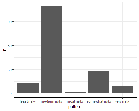
As the bar chart currently stands, the only thing that we can quickly see is that the "medium risky" pattern is the most frequent. But is "least risky" more frequent than "very risky"? Is "somewhat risky" rarer than "most risky"? To answer this question, you have to mentally compare bar lengths. Let's make it easier by sorting the bars!
To order categorical variables by their level, we can use this R function:
factor(column, levels = c("level1", "level2", "level3"))
The column argument is the column containing the categorical variables. The levels argument is the desired order of each categorical value. You'll list these by their names, enclosed in double quotes.
This approach to reordering factors works when you have a few levels, as we have here. If you have many levels or if you need more complicated transformations, you'll need an R package called forcats, which you can read about on its website.