Congratulations! You’ve completed all the exercises in this section!
It’s time for a quick review of bar charts. Remember, a bar chart is used to visualize the distribution of a categorical variable.
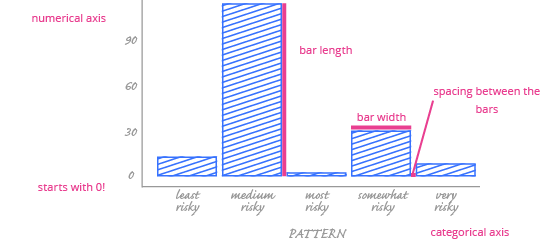
When you’re building a bar chart, pay attention to these best practices:
- Always start your y-axis at 0. Otherwise, readers may draw the wrong conclusions about your story.
- If your categories are ordinal, arrange the bars in logical order. This will highlight the story you’re telling.
- Usually, one color should be used for all the bars in a bar chart. If you want to use another color (or colors) to highlight certain categories, go ahead! But don’t use multiple colors in your bars just to be decorative – it distracts from the data.
- You don’t need to include vertical grid lines in most bar charts. Remove them to reduce clutter.
- It’s okay to leave a space between the bars, but these spaces have no meaning. The width of the bars is meaningless, too.
No matter what chart type you’re using, it’s always good to:
- Choose a descriptive title for your chart,
- Avoid excessively bright colors. Choose colors that are visually pleasing.
In the next part, we’ll discover a chart that can visualize the distribution of numerical variables.