Be careful with the aspect ratio of line charts.
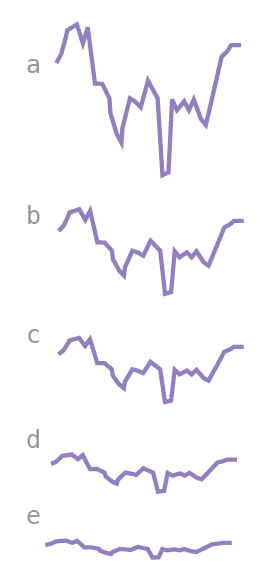
In the image above, you can see five versions of our line chart. The only difference between them is the chart aspect ratio, or the ratio of the chart's height to its width. As you can see, the trends and changes in the data seem to change when we change the chart aspect ratio. The larger the aspect ratio, the steeper the changes appear. This causes readers to interpret the changes as more important. The smaller the aspect ratio, the flatter the line. This makes changes seem small and insignificant. Manipulating the aspect ratio can mislead readers in one way or another.
Is there any rule for choosing an aspect ratio? Yes and no. In reality, the significance of a change depends on the nature of the variable and the goal of our visualization. A change of one unit can be just as significant as a change of 100 units – it all depends on the data. There's no one rule for determining it.
At this point, you're probably familiar enough with your data to understand what is and what isn't significant. In all circumstances, be very aware of the influence of aspect ratio on your chart's appearance.
However, if you truly have no idea of how significant some change is, you can use the "banking to 45 degrees" rule. This states that we should use an aspect ratio that gives the slopes of our lines an average angle of 45 degrees (measured against the vertical axis). Why 45 degrees? Most people can estimate that angle with accuracy.
