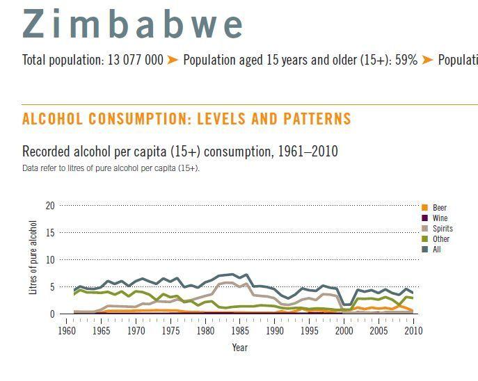
Although the time variable we're using is categorical in nature, we can adapt it to a more continuous interpretation. Let's try to visualize this with a line chart, as it was done in the official 2014 WHO report1 reproduced below.
Why use a line chart for this data as well as a bar chart? The chart used to visualize time-series data will depend on two factors: the nature of the data and the story we want to tell with it. If we want to see specific values and compare their magnitude, we choose a bar chart. If our primary goal is to show trends and see changes over time, we use another plot - the line chart.
Let's use the same data to tell another facet of this story. Let's use a line chart to visualize the trend in Zimbabwean alcohol consumption.
1. Source: World Health Organization. Management of substance abuse, Country profiles 2014 - Zimbabwe