Your data visualization skills are growing – you’ve added the line chart to your repertoire!
Before we move on, let’s have a quick recap of how we use a line chart to show change over time.
As you build a line chart, remember:
You don't have to set zero as the baseline.
Don't hide missing values – i.e. by connecting points with a solid line through the missing values. This gives the impression that the data for that time did not change. Instead, connect the points with a dashed line, or don’t connect the points at all.
Don't use line charts for unordered data (i.e. data that contains nominal variables).
Be aware of aspect ratios; they can change how readers interpret your chart. When in doubt, use the "banking to 45 degrees" rule.
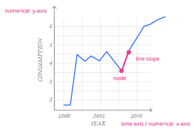
Make the data stand out by changing the color and thickness of the line.
To give context to the data, add value labels to the points.
Use annotations to help readers focus on your story.