Our bars now have an appropriate range. Let's set the proper parameters for our histogram. We will start with the interval length set in the breaks argument.
Make your histogram fit the variability of the data.
Correctly choosing either the number of intervals or the interval length is important. Why? Because it strongly influences the appearance of the chart, which means it directly impacts the conclusions readers make about the data.
In the image below, we present our histogram with four different interval sizes. Look at each one carefully.
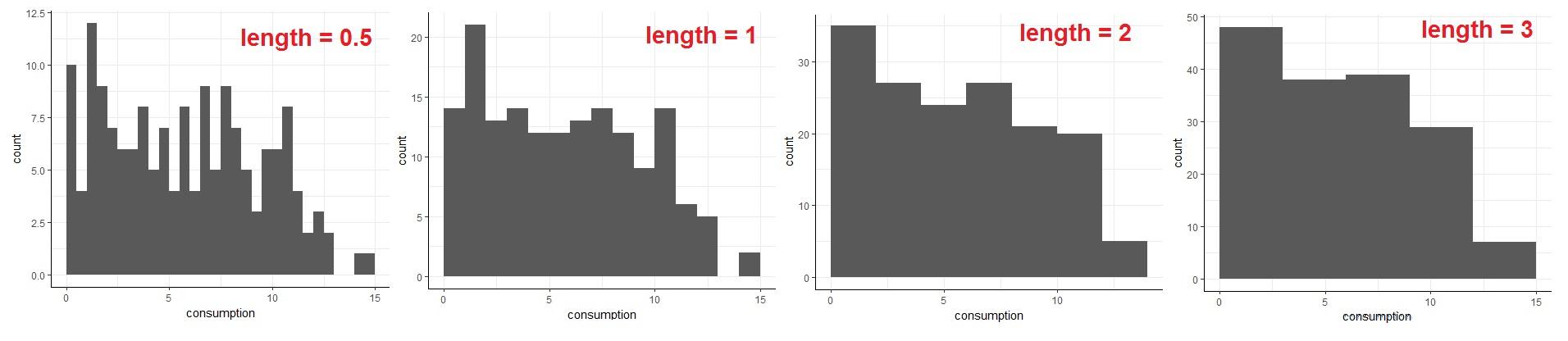
The distribution of our variable looks totally different depending on how we set the parameters for our histogram. The smaller the intervals on the vertical axis are, the fewer values are in each interval. This means we can see a lot of details, but it's hard to draw a general conclusion about the distribution – there is too much variation in the chart. On the other hand, the larger the intervals are, the less you can see details. You might not notice untypical values that should be carefully studied.
The parameters we choose depend on the level of variability we want to show and on the dataset itself. Therefore, you should always test a few different parameters before choosing the final settings. This will enable you to present the data's story in the most effective way.
In our chart, it looks like setting the length to 1 is good – we can see a decline in the number of high-consumption countries, but we can also see details like the gap between 13 and 14 liters. Apart from that, this division is easy to understand; each bar represents one-liter long interval, starting at 0.