Preparing data for a histogram can take some time, but fortunately ggplot will do the math for us – it will automatically take our numerical variable, divide it into intervals, and count the frequencies for each interval. We know how to do this manually, too, so we are more aware of how a histogram is constructed.
Before we plot the histogram, let's consider how the data should be displayed. Look at the image below:
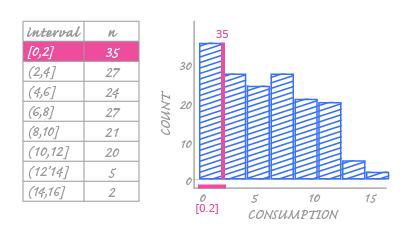
In the image above, we can see how one interval and its related frequency is shown on the histogram. Each interval is represented by one bar located above the numerical horizontal axis. The bar for the first interval [which starts with 0 and ends at 2] is placed at the beginning of the axis. We can already see that histogram bars have their own order that is set by the intervals' limits. It makes no sense to arrange them in any other way.
The next thing we see is how frequencies within each interval are encoded. Like the bar chart, the value for this interval is encoded as the bar height. You can read this value from the vertical axis.
In a bar chart, the spaces between the bars have no meaning. But this isn't the case when we use a histogram. Histogram bars represent specific intervals and strictly correspond to values on the horizontal axis. You can't have a bar for the interval [2,3] and start drawing it at value 3. You can't insert spaces between the bars because everything is on a continuous numerical axis. The bar's interval limits and values must correspond to the same values on the horizontal axis. Therefore, if there is any gap on the histogram, it can only be because that interval has a frequency of zero. Histograms can never have fixed, meaningless spaces between the bars.
