As we expected, the bar chart for our numerical variable consists of lots of very thin bars. Almost every bar represents a frequency of one. What can we read from it? Can we determine the variable's mean value? Can we easily see any atypical values? No. All we can say is that consumption has many different values.
To solve this problem, we can use the histogram. It looks like a bar chart, but it works a little bit differently. Instead of counting single values, the range of the numerical value is divided into equal-sized bins, or intervals. Then, the values in each bin are counted.
Have a look at the histogram scheme below:
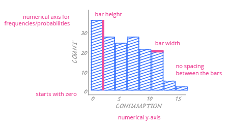
A histogram is designed for a single purpose – presenting the distribution of a numerical variable. Therefore, the vertical axis will always show frequencies or the values proportional to them (like probabilities).
The main difference between a bar chart and a histogram is the horizontal axis. Because histogram bars correspond to intervals over the entire range of the numerical variable, we must use a continuous numerical axis. (Remember, a bar chart would use a categorical axis.) Each bar starts in specific place above the axis and ends in a specific place that is determined by the interval. Also, each histogram bar width corresponds to the length of the interval that it represents. The width of the bars is always the same because the intervals are consistent, but unlike bar charts, the width is not arbitrary. It actually has some meaning.
As with the bar chart, the histogram's most important encoding is in the bar height. This encodes the frequencies for each range of values; the higher the bar, the greater the number of values are in that interval.
