Way to go! You’ve learned quite a lot about the histogram chart!
Let’s have a quick review. A histogram is used to visualize the distribution of a numerical variable. (Bar charts visualize the distribution of a categorical variable.)
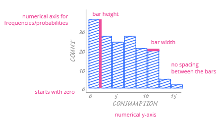
When you create your own histogram, remember these tips:
Always start your y-axis at 0.
Make your histogram fit the variability of the data. Adjust the number of intervals or the length of the intervals to highlight your story.
Spaces in histograms have meaning. Don’t put a space between the bars of a histogram unless the frequency of that interval is 0.
Remove unnecessary grid lines. You rarely need a vertical grid in a histogram.
No matter what chart type you’re using, it’s always good to:
Choose a descriptive title for your chart.
Avoid excessively bright colors. Choose colors that are visually pleasing.