Why Data Visualization Is Important: Two Perspectives


Have you ever wondered how you can deal with an overwhelming amount of data? How do you use it? How do you understand what it’s saying? And last but not least, how do you present your data to the world such that everyone understands your point? In this article, we’ll explore these questions to understand the importance of data visualization.
Where are the data?
When I want someone to understand my perspective, I try to visualize it precisely so I can communicate my thoughts. But to do that, I need to know what data and how exactly I want to show it to my audience.
When I started to think about data visualization, I couldn’t really come up with anything related to my job or daily routine. But the fact that I don’t work as a data analyst doesn’t mean I don’t need any analytical skills or that I won’t need to work with data. That’s why I decided to take a data visualization course and see where it can take me.
Weather, prices, wages, stock, demographics, social changes—all of these depend on large amounts of data. But they’re much easier to understand when they’re visualized. Raw numbers aren’t effective at communicating information—not as effective as graphics, at least.
As a non-IT person, I began taking the course more as an audience of data. For this article, I’ll take a look at two different perspectives of dealing with information: as an audience and as an author.
In the audience’s shoes: making sense of data
After work, I’m a skipper—I sail boats. When I organize sailing trips, I need to prepare well; I collect and analyze data before taking to the open sea. What are boat prices, marina costs, or gas prices? Where do I want to go? What are the depths of wet docks, and what will the temperature be like? Most importantly, what are the wind predictions and weather conditions for the next 48 hours?
I need to be able to distinguish trash information from accurate ones. And this is where data visualization excels. From my experience, I’ve learned it’s better to spend more time analyzing data and putting together questions than waiting until the last minute. This lets me base my decisions on hard facts, which is actually one of the most important skills while on the open sea.
Let’s look at the example presented below:
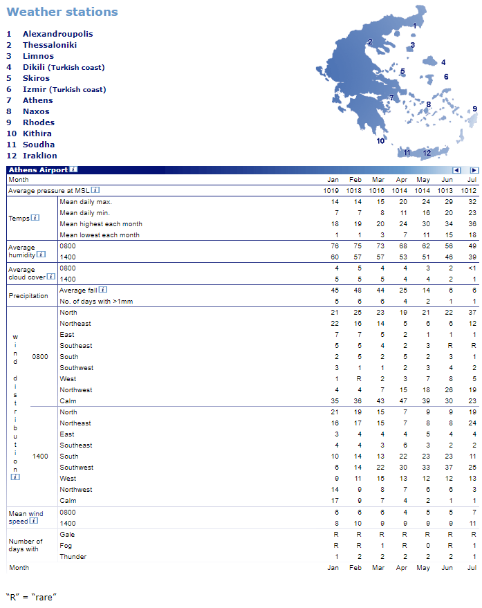
Source: www.sailingissues.com
Here, I have a large table with lots of information. I can read it, but it’s not very clear. If I wanted check something quickly, I would not choose this source.
When the same data is plotted using bar charts, I get a completely different view of the information. Now, it’s a lot more readable:
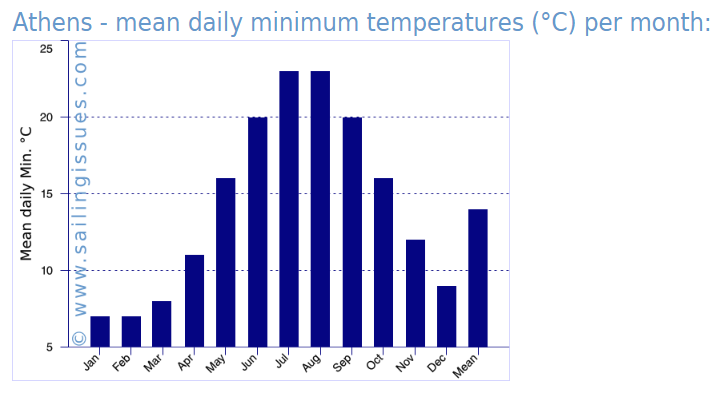
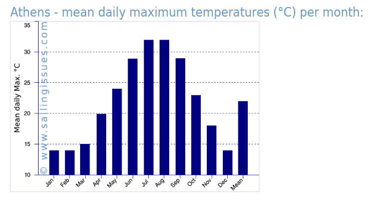
Source: www.sailingissues.com
Most importantly, thanks to this chart, I can take one glance at this chart and make sure I’ll be sailing in the high season. It’s a shame I didn’t find this chart earlier! Maybe I would pick some other date to start my holidays.
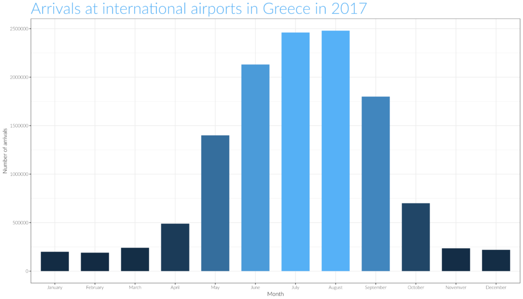
Source: www.sailingissues.com
In the author’s shoes: presenting data
In my job, I’m responsible for implementing online courses. When writing this article, I figured I could take a closer look at data from our learning platform to gather some interesting information. Ultimately, I hoped to draw some sort of conclusion that could help us improve the quality of the content we prepare for our users.
To start, I considered what I wanted to know about our learners and the variables I needed to explore. For example, do users have any difficulties with taking our final exam? Maybe they need more attempts to pass it. Also, how much time do they spend on the program as a whole? Do we provide sufficient time for completing our courses?

With these questions in mind, and with my own personal experience, I came up with a hypothesis: “Users who spend more time on our learning program need fewer attempts to pass our final exam.”
I wanted to create a very simple, clear, and non-technical chart that I could use to present my findings to my colleagues.
First, I decided to use a bar chart to show how much time people spend on our learning program in general. With this in mind, I prepared a dataset with the results of 100 users:
Next, I plotted a chart categorizing the number of attempts it took users to complete our final exam:
To test my hypothesis, I needed to create a chart that would let me visualize the relationship between the two variables: time spent on our learning program and number of attempts required to pass the final exam; I went with a scatterplot. Have a look:
It turned out that my hypothesis was incorrect. According to the data, less time spent on our learning program leads to fewer approaches to pass the final exam. When presented visually, the data threw a different light on the matter. Imagine if I had tried to put together a conclusion based on just the numbers themselves!
The relationship between author and audience
When it comes to presenting data, it’s important to have insight into both perspectives: the audience that digests the data and the author who prepares the data.
I began taking the data visualization course more as an audience of data, but this role changed over time. My first priority was to sharpen my attention to detail so I could process the large amounts of data I encountered in my daily life. I also brushed up on my knowledge of social research methodologies. In summary, I developed strong analytical skills—observing and analyzing data, as well as drawing conclusions.
Surprisingly, data visualization also changed my perspective; it helped me see my users in a different light and corrected my preconceived beliefs about their learning habits.
What about you?
Are you more of an author or an audience? Have you ever assumed both roles? How do you interact with or visualize data in your daily life? I’d love to hear your thoughts—let me know in the comments!


