New Vertabelo Academy Course on Data Visualization: Share Your Insights With Everyone!

In today’s data-driven world, a good visualization goes a long way in helping people make sense of numbers.
Every day at the office, we’re working hard to create programming and data science content that is accessible to everyone. We aim to produce content that is easy to understand, primarily for people with no IT background. And you know what? Ironically, this stuff ain’t easy even if you’re an IT specialist! We seek metaphors and real-life applications; we share our experience to help you ‘see’ those complex concepts we’re trying to teach. We opt to make the courses fully interactive because we strongly believe in learning by doing.
Over the past couple of months, we’ve been developing our new "Data Visualization 101" course. We wanted to open up the doors of data visualization to anyone who’d like to learn this craft but doesn’t know much about it yet. The course is perfect for people interested in data analysis. However, you don’t have to be data analyst to take (or enjoy) the course.
In the course, we’ll be using the R programming package ggplot2 to visualize data, but the good news is you do not have to be a programmer to learn data visualization! There are tons of tools that will do all the programming stuff for you. We’ll guide you through this process and share tons of practical tips on building eye-catching and accurate plots.
Who needs Data Visualization?
If you’re new to data viz, you’re probably wondering why it’s needed. Let’s take data analysis as an example. Analytics is all about decision-making. Companies are collecting large amounts of data on a daily basis, but they often don’t know what to do with them. Visualizing data helps companies see the significance of the numbers they’ve gathered so they can share this information internally and with the rest of the world.
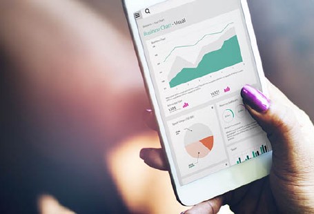
Data visualization is like Snapchat for millenials. It’s the ability to convert text information into beautiful, informative pictures. And unlike one-dimensional charts, data visualization tools let you “talk” to your data—and interact with them!
Ready to start seeing the beauty of data?
"Data Visualization 101" covers the basic chart types and how they’re constructed. After completing the course, you’ll be able to create appealing, accurate, and comprehensible plots. To get started, all you need to know are the basics. So if you’d like to learn about data visualization but don’t know where to start, you’re in the right place.