How to Create Python Heat Maps for Marketing Campaigns


Heat maps are a great way to visualize patterns in data, but some businesses avoid them because creating them seems challenging and time consuming. Well, it’s not.
Do you know what the most popular programming language currently is? According to the PYPL Index, it’s—you guessed it—Python. And our serpentine friend was also crowned the best programming language in 2018 by Linux Journal readers.
Why all the buzz? Because Python is simple and easy to learn. And most importantly, it’s practical. In this article, we’ll take a look at how you can use Python to generate heat maps in order to identify the best time of day and day of the week for starting social media marketing campaigns.
Overview: When to run social media marketing campaigns
What’s the best time for brands to post on Facebook? It’s a fairly open question, even though there are tons of articles and marketing research on the subject. And you know why?
Because… it depends—on the industry you’re in, your target audience, and lots of other factors that can’t be generalized.
So, in order to find the best days and times to start a marketing campaign, you need to do your own research based on the history of your interaction with your core audience.
What data do I need?
Our heat map will use color intensity to reflect the level of engagement that your audience demonstrates across different days of the week and different times of day.
You don’t need any complicated marketing reports to perform this task. All you need is a simple report on your post engagement (or any other metric that you’re interested in) for a period of 1–3 months with an hourly breakdown.
Essentially, your report can just have these three columns:
- The date
- The time of day (hour)
- The number of post engagements
If your report contains a timestamp with a date and time in a single column, that also works for our purposes.
How do I collect this data?
The data you need for a heat map is usually readily available if you have at least some history of interaction with your target market using a digital marketing channel. However, the format of your data might be different.
In this article, we’ll go through the Facebook use case because it’s a platform that’s widely used for social media marketing campaigns by brands in most industries.
Facebook has a great Ads Manager, where you can view and download reports with the results of your marketing campaigns. The tool also allows users to view hourly breakdowns of the reports. Here’s a screenshot with such a report:

You can download a report as a .csv file, which is a suitable format for our next steps. In this article, I’ll work with August_report.csv.
Creating a heat map with Python
Things are about to get interesting!
1. Loading your data
To load your data, you simply need to pass the CSV file name to the read_csv function, which is part of the pandas library (imported here as pd).
Pandas is a great library for data analysis; if you’re unfamiliar with it, we cover it in our Introduction to Python for Data Science course.

With the following line of code, you can save your report as a table named data:
# Loading data:
data = pd.read_csv('August_report.csv')
2. Getting days of the week from dates
Reports usually include dates but not days of the week. We’ll fix this by adding our own column to the table: Day of Week.
# Creating "Day of Week" column
data['Day of Week'] = data['Day'].apply(lambda x: x.dayofweek)
This line of code creates a new column with the day of the week derived from the date. However, the day of the week will be represented numerically by default. Here are the top five rows of our table:
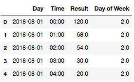
Here, the number 2.0 under Day of Week stands for Wednesday; you can confirm this by looking at the actual calendar for August 2018.
Simply put, this is because we start counting from zero in Python, and according to the ISO 8601 standard, Monday is considered the first day of the week. So we have the following mapping: 0=Monday, 1=Tuesday, 2=Wednesday, …, 6=Sunday.
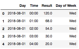
Our next step is to save this information in a dictionary that we can apply to our Day of Week column:
# Changing numbers in "Day of Week" column to words by creating dmap dicionary.
dmap = {0:'Mon', 1:'Tue', 2:'Wed', 3:'Thu', 4:'Fri', 5:'Sat', 6:'Sun'}
data['Day of Week'] = data['Day of Week'].map(dmap)
And here’s the new table:
3. Restructuring our data
The data we have now looks good, but to draw a heat map, we need it to be transformed a little bit. In particular, we’ll need the days of the week to be columns, not entries.
We can easily transform this table using Python in just one line of code:
# Retructuring data
restr_data = data.groupby(['Time', 'Day of Week']).mean()['Result'].unstack()

# Reordering columns
restr_data = restr_data[['Mon', 'Tue', 'Wed', 'Thu', 'Fri', 'Sat', 'Sun']]
The columns are ordered alphabetically by default. So in our case, we needed an additional line of code to reorder the columns so that the days of the week proceed in the right order. Here’s what our data looks like now:
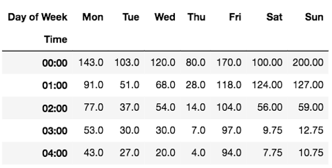
At the intersection of a particular Day of Week and Time, we have the average number of post engagements. For instance, from the above table, we know that on Wednesdays between 00:00 and 00:59, we observed 120 post engagements on average.
Clearly, a table is not the best format for analyzing this kind of information. A heat map, on the other hand, is a prime candidate. And we’re ready to build one!
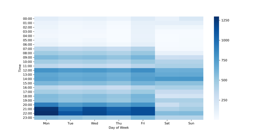
4. Creating a heat map
To draw a heat map, we simply pass the name of our transformed table restr_data to the heatmap function from the seaborn (imported as sns) library. Notice that we’re able to create a heat map using just a single line of code:
# Plotting a heat map
sns.heatmap(restr_data, cmap="Blues")
And here’s the result:
Awesome!
Analyzing the data
The heat map above shows the average number of post engagements by time of day and day of the week. In particular, it shows that:
- The highest customer engagement is achieved in the late evenings on weekdays.
- The best-performing days are Monday, Wednesday, and Friday, but Monday is definitely the leader.
- Your audience is not very responsive on the weekends.
- There’s a surge of activity around lunch time, when people are likely to be on their phones.
These are just a few of the many valuable insights that you can derive from this heat map. And now, you’re ready to run your Facebook Ads more effectively!
The key takeaway: Python is awesome

In this article, we showed how just a few lines of Python code can automate your marketing analysis and make your social media marketing campaigns much more efficient. And chances are that many of your current job tasks can also be easily automated with Python.
Interested? Learn the world’s most popular data analysis language with our Introduction to Python for Data Science course.